Fifty Shades of Cerulean: What the Gallery World's Blue Obsession Reveals About Contemporary Curating
The Gallery That Bleeds Blue
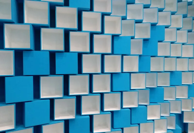
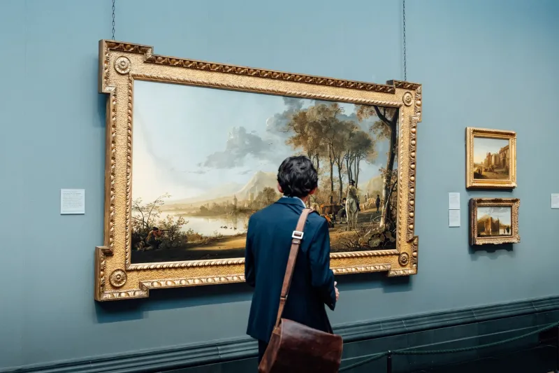
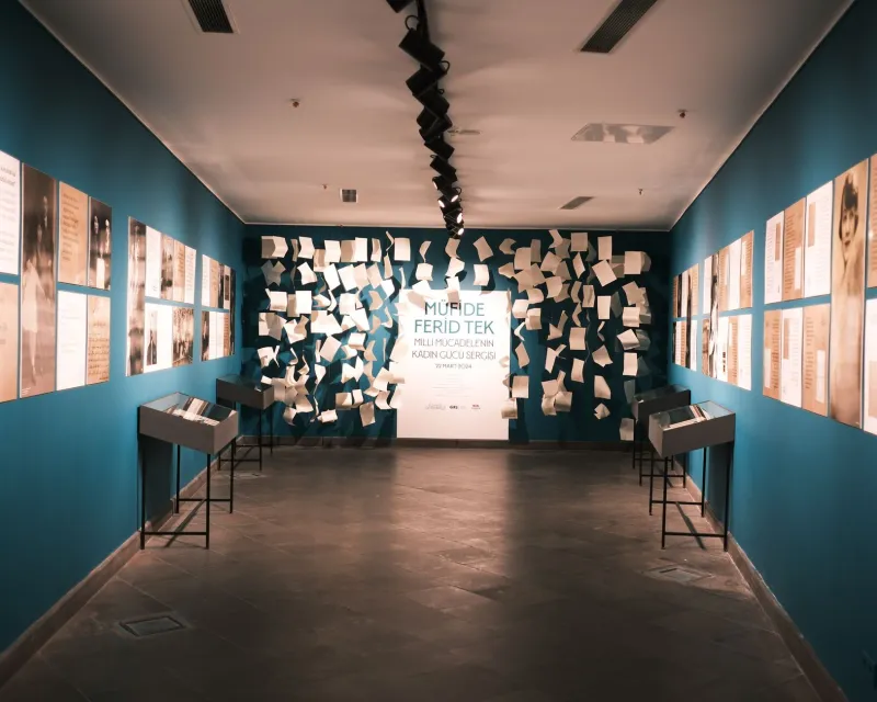
Walk into almost any curated exhibition across Britain's arts centres and you will encounter it — that persistent, almost conspiratorial wash of blue. From installation lighting to painted plinths, from performance backdrops to printed ephemera, blue has quietly colonised the contemporary gallery. But is this convergence accidental, psychological, or something altogether more deliberate?
At Bluecoat, where our very identity is entangled with the colour's resonances — historical, civic, maritime — we felt compelled to investigate. What began as an internal observation during a recent programme review became something considerably more unsettling: a pattern so consistent across UK arts venues that it demands serious curatorial interrogation.
A Chromatic Census
Spend an afternoon cataloguing recent exhibitions at independent arts centres across Liverpool, Manchester, Bristol, and Glasgow, and the data becomes difficult to dismiss. Blue — in its Prussian, cobalt, ultramarine, and indigo iterations — appears as a dominant or significant secondary tone in a striking proportion of major installations. Colour theorist Dr Miriam Hale, who has spent the better part of a decade studying palette trends in institutional art spaces, describes this as 'chromatic drift.'
'It isn't that curators are consciously selecting blue,' she explains. 'It's that the cultural conditions which produce contemporary art — the anxieties, the digital saturation, the particular melancholy of this political moment — are generating blue almost organically. The colour finds the work before the artist consciously reaches for it.'
This notion of blue as an emergent property rather than a deliberate choice is both compelling and slightly vertiginous. If our collective unconscious is painting the gallery walls cerulean, what precisely is it trying to say?
The Psychology of the Threshold
Blue occupies a peculiar psychological territory. Neurologically, it is associated with distance, introspection, and — crucially — trust. In a cultural moment characterised by profound institutional mistrust, the prevalence of blue in arts spaces might function as a kind of chromatic reassurance: come in, this is a safe space for difficult thinking.
Some curators are less comfortable with this reading. Rashida Okonkwo, who oversees programming at a leading Manchester arts centre, pushes back with characteristic directness. 'I think we romanticise colour choice in ways that let us off the hook for much harder conversations about representation and access. Blue is everywhere because white walls feel sterile, and blue reads as sophisticated without alienating. It's the curatorial equivalent of a navy blazer.'
Her scepticism is worth sitting with. There is a version of this story in which blue's dominance is not a profound cultural signal but rather a fashionable default — a consensus aesthetic that spreads across the sector through the interconnected networks of curators, designers, and institutional funders who share references, attend the same conferences, and increasingly blur into a single taste-making apparatus.
Klein's Ghost and the Legacy of Monochrome
No serious discussion of blue in contemporary art can avoid Yves Klein, whose International Klein Blue — that extraordinary, almost violent ultramarine — remains one of the twentieth century's most audacious chromatic gestures. Klein patented his pigment in 1960, declaring it a void that contained everything. His legacy haunts contemporary installation practice in ways that artists sometimes acknowledge and sometimes strenuously deny.
'Klein made blue feel infinite,' says installation artist Callum Trent, whose recent work at a Glasgow venue used deep indigo light to dissolve the boundaries between wall, floor, and viewer. 'But I'm also wary of that inheritance. There's a masculinity to Klein's blue — a grandiosity. I'm interested in a quieter blue. One that asks questions rather than makes declarations.'
This distinction — between blue as assertion and blue as inquiry — runs through much of the most interesting contemporary work. Where Klein's blue announced itself as absolute, many contemporary artists are deploying the colour tentatively, almost apologetically, as though acknowledging that certainty itself is now suspect.
Blue as Political Grammar
The political valences of blue in a British context are impossible to ignore. In a post-Brexit landscape where the colour has been vigorously claimed by competing nationalist and European-federalist narratives alike — the EU's gold-starred azure on one side, the Conservative Party's branding on the other — blue in the gallery carries ideological freight whether artists intend it or not.
Several curators we spoke to were acutely aware of this tension. 'You can't put up a wall of deep blue in 2024 and pretend it's politically neutral,' says one programme director who preferred to remain anonymous. 'Every viewer brings their own blue with them. The EU flag, the police uniform, the sea. We're not painting walls — we're activating archives.'
This is where the analysis becomes most productive. Blue in the contemporary British gallery is not a single colour but a palimpsest — layers of meaning accumulated through centuries of maritime empire, industrial labour, aristocratic heraldry, and digital-age branding. When an artist works in blue today, they are working in all of those blues simultaneously, whether they realise it or not.
What Curators Can Do Differently
The question that follows from all of this is practical as much as theoretical: should curators be more deliberate about their chromatic choices, or does deliberateness risk sanitising what is most interesting about colour's unconscious operations?
Dr Hale argues for a middle path. 'I'm not suggesting we impose chromatic diversity quotas. But I do think curatorial teams could benefit from asking, early in the development process, what their palette is doing and whose emotional register it serves. Blue is enormously comforting to some audiences and deeply alienating to others. It carries class associations, cultural associations, generational associations. Naming those is not a constraint — it's a form of honesty.'
At Bluecoat, this conversation feels particularly resonant. Our name, our history, our position within a city whose identity is inseparable from the deep blue of the Mersey and the Atlantic — all of this makes us conscious custodians of a colour that means more than it appears to. We do not claim neutrality. We claim, instead, the responsibility to keep asking what our blues are for.
The Colour That Thinks
Perhaps the most productive conclusion is also the most uncomfortable one: blue is not merely something that happens to contemporary British art. It is something that contemporary British art is doing — processing, through pigment and light, a set of national and global anxieties that language has not yet found adequate words for.
The gallery, in this reading, becomes a kind of chromatic therapy room. And blue, that ancient colour of sky and sea and longing, is doing the work that the culture cannot yet do in any other medium.
Whether that is cause for celebration or concern may itself be a question that only art — in all its obstinate, blue-drenched complexity — is equipped to answer.