Paint the Revolution: How Independent Arts Venues Are Redesigning Who Belongs
Photo: colourful modern arts centre interior gallery space UK, via www.worldatlas.com
The White Room Problem
For the better part of a century, the white cube has functioned as the unspoken grammar of serious art. Neutral, austere, and aggressively non-committal, its blankness was always sold as a form of respect — a void that would not compete with the work on the walls. What that argument conveniently obscured, however, was whose comfort that void was actually designed to protect.
Walk into most major institutional galleries today and the message remains encoded in the plaster: this is a space that rewards prior knowledge, that expects a certain posture, a certain quietude, a certain confidence that you have already earned the right to be here. The white cube does not welcome. It auditions.
Independent arts centres across the UK are increasingly aware of this dynamic — and they are doing something about it. Not through mission statements or access policies alone, but through the far more immediate language of paint, light, furniture, and floor plan.
Colour as Argument
The psychological relationship between colour and behaviour is well-documented in retail and hospitality design, yet the arts sector has historically been reluctant to apply those principles to its own spaces, perhaps fearing accusations of manipulation or commercialism. That reticence is dissolving.
Several UK venues have begun working directly with colour psychologists and community researchers to understand not just what hues feel welcoming, but to whom, and why. The findings challenge comfortable assumptions. Deep terracotta tones, for instance, have been shown to reduce the anxiety associated with formal cultural spaces among first-generation gallery visitors. Rich forest greens signal permanence and rootedness rather than the transience of the white cube's eternal present. Warm ochres and burnt siennas evoke domestic familiarity without condescension.
These are not arbitrary aesthetic choices. They are, in the most precise sense of the word, arguments — made in pigment rather than prose.
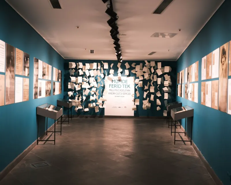
At venues in cities including Manchester, Bristol, and Liverpool, entrance halls and foyer spaces have been repainted in tones drawn explicitly from community consultation. The intention is to signal, before a single piece of art is encountered, that this building was not designed for a pre-existing audience but shaped around the people who actually live nearby. The difference in visitor behaviour — the willingness to linger, to speak at normal volume, to bring children without whispered apologies — has been observed repeatedly by venue staff, even where formal evaluation remains ongoing.
Spatial Democracy
Colour alone, however, cannot do the work that spatial configuration also demands. The traditional gallery layout — discrete rooms, linear progression, artworks fixed at a height calibrated for a standing adult of average stature — encodes its own hierarchies. It tells you how to move, where to pause, and implicitly, how long your attention is expected to last.
Flexible spatial design, by contrast, refuses those instructions. Modular seating that can be rearranged. Artworks installed at varying heights. Threshold spaces that blur the boundary between gallery and café, between exhibition and conversation. These are not compromises forced by limited budgets — though tight finances have certainly accelerated creative thinking — but deliberate rejections of the assumption that art must be encountered in a single, prescribed manner.
Some venues have gone further still, replacing fixed reception desks with roaming hosts, eliminating the gatekeeping geography of the traditional front-of-house entirely. Others have introduced what might be called 'permission spaces' — areas explicitly designed for sitting on the floor, for making noise, for bringing food — that communicate, architecturally, that the usual rules of cultural deference do not apply here.
The Risk of Aestheticising Inclusion
It would be naive, of course, to suggest that a tin of paint resolves the structural inequalities that keep significant portions of the British public estranged from contemporary art. There is a real danger in what might be called the aestheticisation of inclusion — the belief that the right colour palette substitutes for genuine programming diversity, meaningful community partnership, or fair pay for artists from underrepresented backgrounds.
Several arts professionals have raised exactly this concern. A beautifully designed, warmly coloured foyer that leads to programming conceived entirely without community input remains, at its core, a gilded cage. The design must be the beginning of a conversation, not its conclusion.
Nevertheless, the evidence from venues that have pursued both spatial redesign and deeper programmatic change simultaneously is genuinely encouraging. When the physical environment signals openness before a visitor has read a single wall label, it lowers the threshold of engagement in ways that more traditional outreach cannot always replicate. Bodies respond to space before minds process intention.
What Comes After White
The shift away from gallery white is, in this sense, more than a design trend. It is a reckoning with the cultural assumptions built into the very architecture of arts institutions — assumptions about whose aesthetic sensibilities are worth accommodating, whose discomfort matters, whose presence is imagined when a space is designed.
The most thoughtful UK arts centres are approaching this reckoning not as a problem to be solved once and memorialised in a refurbishment, but as an ongoing practice. Colours change. Layouts evolve. Communities are consulted not at the point of design but continuously, as the building is used and the conversation about who it belongs to is perpetually renewed.
In that sense, the most radical thing about this movement is not any particular shade of terracotta or any specific arrangement of modular seating. It is the acknowledgement that a cultural space is never finished — that it must remain, always, in active negotiation with the people it claims to serve.
The white cube, by contrast, declared itself complete the moment the paint dried. That, perhaps, is its most revealing quality of all.