Threshold Politics: What Your Arts Centre's Foyer Is Really Telling You
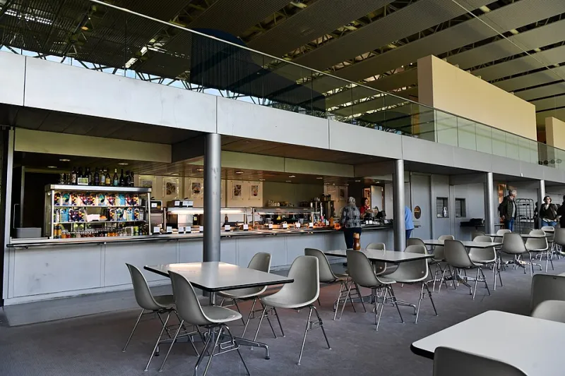
Photo: Michael Garlick , CC BY-SA 2.0, via Wikimedia Commons
The moment you step inside a British arts centre, before a single artwork has been encountered, the building has already told you whether you belong. From the temperature of lighting to the weight of a door handle, every material decision carries institutional intent — and not all of it is as progressive as the programming it houses.
This is the uncomfortable truth that sits beneath the surface of contemporary arts infrastructure: organisations that champion radical inclusion frequently occupy spaces whose physical grammar speaks an entirely different language. The politics of colour, texture, and spatial hierarchy are not peripheral concerns. They are, in many respects, the most honest manifesto an institution possesses.
The Semiotics of the Entrance
Consider what happens architecturally before a visitor has moved beyond the reception desk. The choices made in that threshold space — the foyer, the entrance hall, the transitional zone between street and gallery — communicate volumes about assumed audience. Polished concrete floors read as contemporary and culturally literate to one demographic; they read as cold, unwelcoming, and faintly intimidating to another. Exposed brickwork signals authentic creative heritage to those already embedded in arts culture; to others, it signals a building that hasn't been properly finished.
None of these readings is objectively correct. All of them are socially conditioned. And arts centres, which frequently draw their funding from public bodies committed to widening participation, have a particular responsibility to interrogate which social conditioning they are reinforcing.
The psychologist Minette Walters, writing on environmental belonging, describes what she terms 'permission architecture' — the subtle spatial signals that tell certain bodies they are expected and others that they are tolerated at best. High ceilings and minimalist walls, she argues, are not neutral aesthetic preferences. They are inherited from a tradition of cultural gatekeeping that equates restraint with sophistication and abundance with vulgarity. When arts centres adopt this visual vocabulary uncritically, they do not transcend that tradition. They perpetuate it.
Colour as Class Signal
Perhaps no design element operates more covertly than colour. The dominant palette of contemporary UK arts venues — all chalky whites, muted greys, and occasional interventions of institutional sage green — is presented as a neutral backdrop that allows the work to speak. In practice, it speaks rather loudly itself.
This colour language belongs to a specific tradition of cultural authority: the gallery white cube, developed in the twentieth century as a supposedly democratic space that stripped away decorative distraction. What it actually stripped away was familiarity for anyone not already socialised into gallery-going culture. The white cube does not welcome; it examines. It places the visitor under the same scrutiny as the artwork.
Some venues are beginning to push back. Certain independent arts centres across the North and Midlands have introduced dramatically warmer entrance palettes — deep terracottas, generous ochres, layered textiles — drawing consciously on the domestic visual cultures of their surrounding communities. The response from established arts commentators has been revealing. Words like 'busy' and 'distracting' appear with suspicious frequency in reviews, betraying an assumption that sophistication requires visual austerity.
At Bluecoat, where the Georgian architecture provides a complex historical backdrop, the challenge is particularly nuanced. The building's bones speak of an eighteenth-century mercantile confidence that demands honest acknowledgement rather than cosmetic neutralisation. The question is how contemporary interventions within that space can actively complicate its inherited authority rather than simply inhabiting it.
Lighting and the Architecture of Anxiety
Lighting design is perhaps the most underexamined tool in the vocabulary of spatial belonging. Gallery lighting — typically cool, directional, and calibrated to illuminate work rather than people — creates an environment in which visitors become secondary figures in their own experience. This is not accidental. It descends from a curation philosophy that prioritises the artwork's encounter with the ideal viewer over the actual human experience of encountering art.
Contrast this with the lighting culture of spaces that communities have historically claimed as their own: the warmth of community halls, the generous luminosity of South Asian wedding venues, the theatricality of Caribbean social clubs. These are spaces designed to illuminate people, to make bodies feel celebrated rather than scrutinised. When arts centres invest seriously in lighting redesigns that move toward this register, the effect on first-time visitor confidence is measurable and significant.
Several venues participating in Arts Council England's Creative People and Places programme have documented precisely this. Adjustments to entrance lighting alone — warmer colour temperatures, reduced directionality, increased ambient fill — produced notable increases in the proportion of visitors who described themselves as feeling 'welcome' rather than merely 'permitted'.
The Tyranny of the Legible Plan
Spatial hierarchy — the way a building organises its internal geography and communicates that organisation to visitors — is another site of unexamined gatekeeping. The convention of the single, clearly signposted route through a venue, with the gift shop positioned at the exit and the café visible from the entrance, is a retail logic borrowed from leisure industries and applied to cultural spaces with surprisingly little critical examination.
This legible plan reassures those already comfortable in arts environments. For first-time visitors, however, legibility can function as surveillance. The knowledge that one's movements are anticipated and directed produces a particular kind of self-consciousness that is antithetical to genuine cultural exploration. Some venues are experimenting with more deliberately labyrinthine or ambiguous spatial arrangements — not to disorientate, but to equalise. When no one is entirely certain where they are going, the social hierarchy between experienced gallery-goer and newcomer temporarily collapses.
Designing for the Uninvited Guest
The most radical proposition in contemporary arts centre design is deceptively simple: to design as though the primary audience is someone who has never visited before and has no particular reason to assume they would be welcome. This requires a fundamental inversion of current practice, which typically designs for the already-converted and then adds 'outreach' as a corrective afterthought.
It means asking not 'how do we make our aesthetic legible to new audiences?' but 'whose aesthetic have we excluded by defaulting to our own?' It means treating material choices — every paint colour, every flooring decision, every choice of typeface on a directional sign — as political acts with real consequences for real communities.
Britain's arts centres are, at their best, among the most genuinely democratic cultural institutions this country possesses. They exist outside the commercial imperative that shapes commercial galleries and the heritage obligation that constrains national museums. That freedom is precious. It ought to extend all the way to the door handle.
Because the door handle is where it begins. And far too often, it is also where it ends.